
by Andrea Gauthier
Learning to read is challenging, even for witches and wizards. And it’s even more challenging when those witches and wizards can’t attend Hogwarts in person and must learn to read in an online, home-schooling context with limited interaction with their teachers. (For the purposes of this blog, let’s ignore the fact children in the world of Harry Potter only start attending Hogwarts at age 11 and fundamentally mistrust muggle technology). This is why, during the third UK lockdown beginning in January 2021, some schools participating in the iRead project (e.g., Hogwarts) sent children home with their Navigo tablets, so that children could exercise their reading skills in a fun, scaffolded way. However, the home-schooling play context presented challenges for teachers, as they were unable to monitor their students’ struggles and frustrations—or even know which children were engaging in the game-based learning activities.
Following participatory design research with teachers, the iRead team began developing a “Learning Analytics Dashboard”. Learning analytics are the clicks and performance data produced by children playing Navigo, which are collected and displayed visually on the interactive dashboard. These displays are intended to mirror what the children are doing in Navigo, and allow teachers to explore this data to determine (a) who has been playing what games and when, (b) what areas of reading need more support overall, and (c) which children might need more support in specific areas going forward. Importantly, we wanted this dashboard to still be informative and beneficial to teachers once children returned to using Navigo in the classroom, so that they don’t have to resort to memory extraction spells and pensieves.

The dashboard was created using Tableau, a powerful and intuitive visual analytics software. We’ve been trialling the dashboard with one school, who we will call Hogwarts in this blog, for purposes of anonymity. Below, I describe how the design of the dashboard aims to meet the three objectives listed above. It should be noted that, while I’ve used fictional names of witches and wizards from the popular children’s book series, the data presented below is derived from a real muggle classroom in England.
(Tableau practitioner notes are denoted as [i-iv] and expanded upon at the bottom of this blog.)
Who has been playing what games and when?
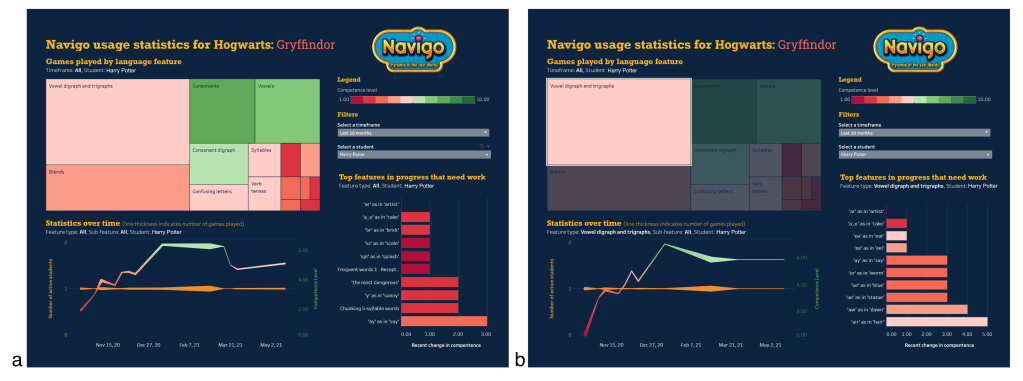
Figure 1a depicts the Learning Analytics Dashboard for Hogwarts’ Gryffindor house [i]. The dashboard has four main components. First, in the top right, are the legends and filters that apply to the entire dashboard. The “competency level” legend codes the other graphical displays by colour, depending on children’s mastery of target concepts and skills, where 1.00 is very low competence and 10.00 is complete mastery. The timeframe filter allows teachers to select what data they want to look at. In Figure 1a, it is currently set to the last 10 months, which covers the entire time Hogwarts has been participating in the iRead project. Teachers can also filter by student, which we will look at later.
Secondly, a tree map in the top-left plots the number of games children completed in specific language features (e.g., vowel digraphs and trigraphs, consonants, suffixes, confusing letters, etc.), wherein larger blocks represent more games played. Hovering over different blocks will provide more information about the frequency and mastery of specific language sub-features that were practiced, as shown in Figure 1b [ii].

Thirdly, in the bottom-left, a line chart plots statistics over time. The orange line plots the number of students playing, so that teachers can take note of dips in participation, particularly important during the pandemic lockdown. The red/green gradient line plots children’s overall competence, so that teachers can identify general trends over time. The thickness of the lines represents the number of games played, so very thin lines would indicate to teachers that the competence data should be interpreted with caution.
An important feature of this dashboard is that views can be filtered by selecting different components. In Figure 2a, we’ve selected the vowel digraphs and trigraphs feature in the tree map, which then filters the other views, including the line chart, to display only data related to that language feature. This shows that Gryffindor’s competence in vowel digraphs and trigraphs appears to increase relatively steadily over time. Then, by hovering over each data point in the line chart, we can see who practiced vowel digraphs/trigraphs on that day, as well as identify who was struggling (Figure 2b and c).

What areas of reading need more support overall?
A fourth and final area of the dashboard is a bar chart, in the lower-right, to help teachers identify reading areas requiring most support. This chart displays the top 10 language features “in progress” that need work [iii]. A language feature is considered “in progress” if more than one child has completed at least three Navigo mini games on that feature. Again, selecting a block in the tree map will filter for the top sub-features that need work in any one language category. Like in the line graph (Figure 2b), hovering over this bar chart will show a list of all students and their performance in the hovered sub-feature. This is a fast and easy way to see features with the lowest level of competency, to help the teacher decide if more games should be assigned to that feature, or if that feature requires further instructional intervention in the (virtual) classroom.
Which children might need more support in specific areas going forward?
There are several ways to find out which children need additional support through the dashboard. Above, I described that hovering over the line chart and the bar chart provides a list of students and displays the number of games played and their performance on those games (Figure 2b). So, let’s look more closely at the output (Figure 2c) … we can see that, on December 13th, Hermione Granger was performing well in her vowel digraphs/trigraphs exercises (unsurprising!), while Harry Potter was really struggling. This merits further investigation to figure out if Harry needs extra support. In the “Select a student” filter, let’s select Harry’s name, which filters the dashboard to only show Harry’s data (Figure 3a). Now, let’s select vowel digraphs and trigraphs in the tree map (Figure 3b). We can see in the line chart that, while Harry did struggle earlier in the year with this language feature, his competence has increased steadily over time. In the bar chart, we can identify the specific sub-features in vowel digraphs and trigraphs that Harry still struggles with, like ‘ar’ as in ‘artist’ and ‘a_e’ as in ‘cake’. Harry’s teacher can now decide if Harry needs an instructional intervention on these sub-features or more practice through Navigo. Harry’s teacher can also look at what Harry is good at (e.g., consonants and consonant digraphs) and praise him for his good work, to sustain his learning motivation. In this way, the dashboard can help Harry’s teachers to support him in becoming a more proficient reader.
But there are many questions left to answer about the design of this dashboard. What aspects did teachers find most useful? How did they typically go about exploring the data on the dashboard? Did exploring this data actually influence their in-class instructional strategies and/or what reading activities they assigned to children? And, most importantly, did changes in teachers’ strategies improve children’s reading competency? We hope to continue our work with Hogwarts through (a) interviews with teachers and (b) analysis of teachers’ interactions on the dashboard [iv] to find out more.

Tableau practitioner’s notes
Below, we include a few reflections (e.g., tips for creative design solutions) that other practitioners of Tableau may find useful.
[i] Usually, titles on Tableau Dashboards are static. Our Dashboard title is made dynamic by creating it first as a Sheet (with empty data) and then placing the Sheet onto the Dashboard. This Sheet uses the “title” element with variables embedded into it as parameters. For instance, our title uses the formula “Navigo usage statistics for <school_name>: <class_name>”. We have row-level permissions attached to the data, so that, upon a teacher logging in, they are only presented with data from their own class, and the title adjusts appropriately.
[ii]Tableau’s “Viz in Tooltip” is used for the hovering feature, wherein additional Sheets are created with the bar charts illustrated in Figures 1b and 2b. Filtering actions made within the tree map dynamically update the tooltip visualisation… however, practitioners should be aware that any Dashboard-generated filtering actions (e.g., selecting a date in the line chart to filter the tree map) will not automatically apply to the tooltip, so these actions must be manually applied within the parent Sheet (i.e., the tree map Sheet in this running example).
[iii]The “Top features in progress that need work” sheet uses a Set to select only features with the lowest competence values. Like many Tableau practitioners, we had some trouble with this view upon filtering for additional variables, like different language features and students. This requires contextualising your filters, as this tutorial describes.
[iv]There are several off-the-self extensions that can be purchased and embedded into your dashboard to track users’ interactions in Tableau dashboards, e.g., Dashboard usage 2.0 by AppsforTableau or TableauTracker by Starschema (neither of which we have tested). We opted for a make-shift approach that uses dashboard URL actions and a Google sheet, as described in this tutorial by Tableauing. Using this technique has enabled us to track teachers’ cursor hovers and selections, as well as document the states of various variables during those interactions (e.g., filters by anonymous student ID or timeframe). Other practitioners thinking of using this approach should read about the inability to use aggregate variables in URL actions and how to get around that limitation.
Acknowledgement
We would like to send a big thank you to Tableau’s Adam Alexander, Marta Barnden, and the rest the Tableau team for their help in getting our Dashboard up and running.
